

Revamping the design of a whole slide imaging platform for pathologists
Senior Product Designer
UX Audit & Research | Design Systems | Information Architecture | Responsive Design | Visual Design | Stakeholder Alignment | B2B
OVERVIEW
A powerful platform weighed down by its own complexity
This is a enterprise digital pathology platform used across hospitals and diagnostic labs in India. While technically capable, supporting whole slide imaging (WSI), AI-powered diagnosis, annotation, and multi-user case collaboration, the platform had accumulated layers of features and UI debt that made it difficult to use in clinical settings where speed and clarity are critical.
I was brought in to lead a comprehensive revamp: audit the existing experience, eliminate redundancy, and redesign the interface with a focus on clarity, efficiency, and trust.
Objective:
To modernize a medical whole-slide imaging (WSI) system by simplifying complex workflows, improving visual hierarchy, and removing feature bloat. To design an intuitive, high-precision, and enterprise-grade digital pathology platform that streamlines the end-to-end laboratory workflow, from physical slide capture to diagnostic analysis, minimizing user error and reducing diagnostic turnaround times.
CONTRIBUTION
Full ownership of the revamp
This was not a incremental polish pass, it required understanding complex pathology workflows, conducting user research with lab technicians and pathologists, and making difficult calls about what to cut versus what to keep.
I worked in close alignment with backend and frontend engineering teams, hardware integration specialists, clinical product managers, and laboratory medical consultants. The hardware-software synchronization dimension, where the UI must respond to real physical events from the microscope (motor positioning, slide detection, optical capture), made this significantly more complex than a standard SaaS B2B redesign.
THE PROBLEM
Too many features, not enough clarity
The existing platform had been built iteratively by engineering, with features added as requested by clients but never reviewed holistically. The result was a UI that exposed every option at once, overwhelming clinicians at the exact moment they needed focus.
The original platform was a feature-heavy tool used by pathologists and lab technicians. It suffered from:
Misaligned Mental Models & Low Intuition:
Core interactive patterns failed to map to the natural physical and mental workflows of lab technicians and clinical specialists. This disconnect forced users to continuously second-guess UI behaviors, resulting in severe user frustration, widespread confusion, and significantly extended diagnostic turnaround times.
Workflow Friction:
Critical hardware operations, such as initializing a physical slide scan, managing multi-slot configurations, and executing auto-captures, lacked a predictable linear logic.
Information Overload:
The primary digital workspace was heavily compromised by overlapping tools, redundant menu actions, and cramped, unformatted metadata fields that accelerated cognitive fatigue.Example: "Case Details" and "Tools Panel"
Visual & Environmental Inconsistency:
A dated interface aesthetic failed to convey the precision and clinical trust required for high-stakes medical software. Furthermore, it lacked the cross-device scaling needed as specialists moved between desktop workstations and mobile tablets.
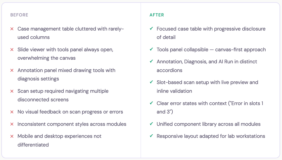
BEFORE & AFTER
The scope of what changed
Strategic Solutions & Enhancements
FEATURE DEEP DIVE . 01
Case dashboard - from data dump to triage hub
The case list is where every pathologist session begins. The original design rendered all available data fields simultaneously in a flat table - case name, dates, slide count, origins, reporting status, user assignments, and patient details, with no visual hierarchy between what's urgent, what's routine, and what's background information.
The actions like 'Edit' and 'Filter' were not integrated properly which made interactions unintuitive.
Before:

Logo
After:

Logo
The redesign restructured the table around the clinical triage model: what do you act on immediately, what do you monitor, and what is reference data?
The redesigned table strips back to what matters: case name with its unique ID, slide count, sample origin tags, creation date, expiry date with a time-urgency indicator ("10 days left" in amber), an inline reporting status dropdown, assigned users, and a single edit action. Everything actionable without opening the case.
Creating a new case was moved from a full-page flow to a focused modal, collecting only the essentials upfront: case name, sample origin, patient details (age, gender), and patient ID. This keeps the user in context rather than navigating away from the list.
Logo

New Case modal — minimal fields, inline validation, case creation without leaving the dashboard
Logo
FEATURE DEEP DIVE . 02
Case viewer - a structured hub for everything a case contains
Previously, opening a case dropped users into the slide viewer with no structured way to access patient context, attach clinical documents, or manage gross specimen imaging. There was a left side panel for slides where Case Details seamed as secondary details. The actions were scattered and did not have a intutive flow.
Before:

After:
The redesigned case viewer introduces a right-side panel with four-tab navigation: Details, Slides, Comments, and Annotations, keeping the main canvas clear while making every case dimension reachable in one click.
The side panel move from left to right was intentional to align with the existing user mental models.

Logo
Case viewer - Right panel with tabbed navigation, patient information, case expiry, gross imaging, clinical documents, and microscopic findings
FEATURE DEEP DIVE . 03
Scan workflow - a hardware-integrated, guided sequence
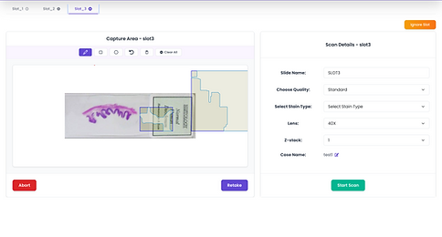
The scan workflow connects software directly to a physical microscope. A lab technician must place slides, configure capture areas, set scan parameters, and initiate the scan, all while the system maintains real-time synchronisation with the hardware. An error or interruption at any point has real consequences for lab throughput.
The original flow was fragmented with no linear logic, no state persistence between slots, and no meaningful hardware feedback. The redesign structures it as a clear three-stage sequence.
Before:

After:

Logo
Manual Capture (for targeted regional focus) or Auto Capture (automated tissue detection and whole-slide imaging). The last activity context is shown so returning users know their starting state.

Logo
A split-panel layout - live microscope preview with capture-area drawing tools and scan parameters on the right (slide name, quality, stain type, objective lens, z-stack, case name). Each slot holds its own configuration independently.

Logo
The capturing state - The scan screen shows the tissue being captured live, a progress percentage, and a running estimated time - giving technicians real feedback from the hardware as the scan runs.

Logo
Scan success - clear confirmation with two forward paths: close and refresh, or start a new capture immediately
FEATURE DEEP DIVE . 04
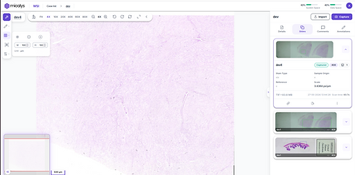
Slide viewer - the canvas belongs to the pathologist
The original design forced a persistent right-side tools panel occupying significant canvas width at all times.
The redesigned viewer inverts this: tools float as a left-side icon column, appearing contextually and expanding only when triggered, giving pathologists back their full canvas by default.
Before:

After:
Logo
Panels Open

Logo
Panels closed
FEATURE DEEP DIVE . 05
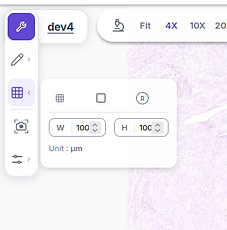
Annotation toolbar - precision tools without canvas compromise
In digital pathology, annotation is a clinical act. Pathologists draw regions of interest to mark abnormalities, delineate structures for AI analysis, and communicate findings to colleagues.
The previous panel mixed everything into a flat view, creating noise at the moment precision was needed.
The redesigned annotation system lives in a floating left-side toolbar, a vertical icon column with expandable panels that appear on demand. The Annotate panel expands to reveal drawing tools, color and scale adjustments. The colour correction panel is separately accessible below, with individual sliders for brightness, contrast, saturation, and hue, with reset and save.
Before:


After:

Logo

Logo
FEATURE DEEP DIVE . 06
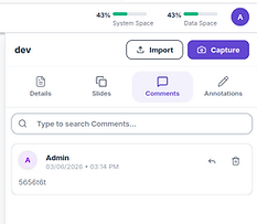
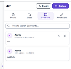
Collaboration - clinical discussion built into the case
Digital pathology is inherently collaborative, cases are reviewed by multiple specialists, shared for second opinions, and audited for quality control.
The Comments tab has been added in the redesigned version to bring team communication directly into the case view, alongside a searchable thread and threaded reply support, keeping clinical discussion contextual rather than siloed in an external channel.

FEATURE DEEP DIVE . 07
Responsive architecture - designed for how labs actually work
Medical professionals don't stay at one workstation. Pathologists analyse slides on high-resolution multi-monitor lab arrays, then consult on tablets during hospital rounds, ans share with other pathologists for consultation.
The original platform served an identical dense desktop layout to every device, causing broken layouts, accessbility and usabiltiy issues.
The revamped version is responsive to different screen sizes for desktops and tablets making it usable on any screen size.
FEATURE DEEP DIVE . ERROR HANDLING
Feature Deep-dive · Error Handling
In a clinical lab environment, errors are not edge cases, they are an expected part of working with physical hardware. A microscope can lose its USB connection mid-scan. A trigger signal can fail between the software and the device. A slide upload can time out mid-transfer.
In the previous platform, all of these surface as the same thing: a blank screen or a generic spinner that offered no path forward.
The redesigned error handling system is built around a single principle: every error must identify what broke, why it likely broke, and what the user should do next - without requiring them to understand the underlying technical cause.

When a hardware-level error occurs, such as the microscope trigger not responding, the error screen does three things simultaneously.
First, it names the failure precisely: "Capture error (slot 1): NoneType object has no attribute Trigger", so engineers and power users can diagnose it without guesswork. Second, it translates that into a human-readable troubleshooting checklist: switch on the device, check USB connections, try aborting and restarting, restart the PC if the issue persists. Third, it provides a single, unambiguous action "Abort", so the user is never stuck on the screen with nothing to do.This is a deliberate departure from the previous approach of surfacing raw error codes or leaving the screen in a frozen state.
The design acknowledges that the person reading this message is likely a lab technician standing at a microscope, not a developer, and optimises the language and affordances accordingly.

Logo
Hardware error state - capture failure on slot 1 surfaces with the specific error, a structured troubleshooting checklist, and a single clear abort action

Logo
Inline error toast in the slide viewer - non-blocking, dismissable - so a failed slide upload doesn't interrupt the pathologist's analysis session
For non-critical errors, like a failed slide upload during a live viewing session, the approach is entirely different.
Rather than a full-page takeover, the error surfaces as a dismissable toast notification anchored above the slide canvas: "Error Detected! There was an error with slide upload. Please try again." The error is visible and actionable, but the primary task remains in focus. This two-tier error model, full-page takeover for hardware failures that block all progress, and inline toast for recoverable errors that don't, reflects a core principle of the redesign: the severity and presentation of an error should match the severity of its impact on the user's workflow. Not every error deserves to stop everything. But the ones that do need to clearly communicate what happened and what comes next.
DESIGN SYSTEM
A shared foundation across three clinical modules
Before this project, there was no dedicated component library and each element deferred in size, shape, visual style, patterns, and interaction behaviour.
The new system standardises everything and makes it consistent across modules and screens.
Components Library
Shared status badges, table rows, slide cards, modals, accordions, and upload dialogs, consistent across all three modules.
Interaction patterns
Standardised inline editing, tab navigation, upload flows, error states, and confirmation dialogs, reducing relearning between modules.
Clinical typography & colour
A type scale and colour system optimised for high-density data display and lab lighting, designed to reduce eye strain during extended analysis sessions.
OUTCOMES
Faster workflows, fewer errors, higher clinical confidence
40%
Reduction in scan setup and initiation time, guided wizard vs disconnected screens
3X
Faster routine case updates, inline editing from the dashboard without opening cases
↓ 60%
Support tickets related to scan errors and UI confusion post-launch
Beyond workflow metrics, the revamp delivered a qualitative shift, clinical users described the new platform as "more professional," "easier to trust," and "less overwhelming." For a medical device company, perceived trustworthiness and precision are not soft outcomes, they directly influence purchasing decisions and clinical adoption.
The new design library also reduced time-to-design for new feature requests, giving engineering and product a common visual vocabulary that compressed design review cycles and reduced implementation drift across modules.
REFLECTION
What designing for clinical environments taught me
Healthcare software operates at a different stakes level than consumer products. A confusing UI in a e-Commerce app is friction. In a pathology platform, it can slow diagnosis, introduce transcription errors, or erode trust in a tool that clinicians depend on daily. This project pushed me to interrogate every interaction decision more rigorously than I had before.
Working with lab technicians and pathologists in research surfaced a consistent pattern: the most valuable design moves are often invisible. A status badge that removes the need to open a case. A floating toolbar that restores canvas space. A live scanning tile that tells a technician the hardware is actually working and not just waiting. These aren't flashy features, they're friction removed from a workflow that runs dozens of times a day.
The hardware-software integration dimension was genuinely new territory. Designing for states driven by physical events, slide placement, motor positioning, optical capture, requires thinking beyond the typical user-initiated interaction model. The UI must communicate machine state clearly, fail gracefully when hardware interrupts, and guide users back to a productive state without requiring them to understand the underlying mechanical process.